My group members consisted of, Holly Cardwell, Matthew Duddy and Rose Connolly.
In order to view their blogs, please click on their names above.
This week we were given a task to watch, research and work on a film. Our group was assigned the film Jacob’s Ladder.
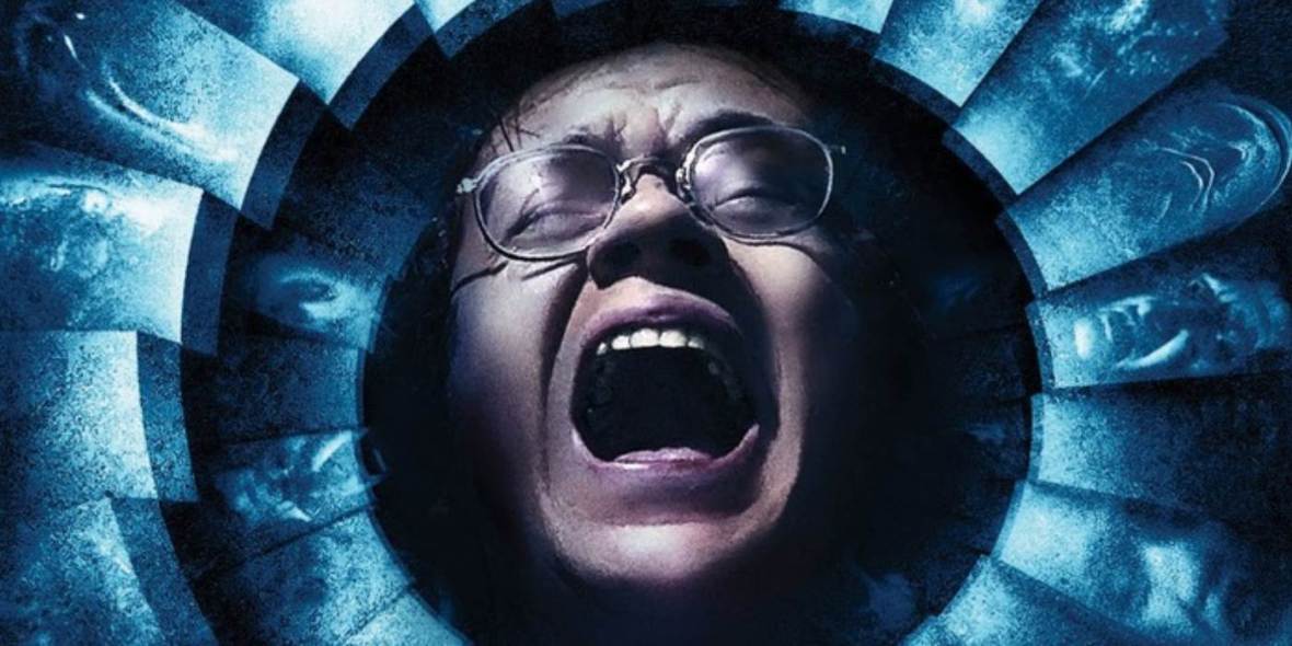
Jacob’s Ladder Image – (Image sourced from Itcher.Com)
Watching it the first time, I found it interesting, unique and a bit confusing. It contains a vast amount of detail, thought and several themes. The film presents many standpoints, varying from Political views and Governmental schemes to Religious ideas of purgatory and the afterlife. Therefore, making it a film that you need to rewatch again and again to get the full meaning from it and fully understand what is happening.
Rough Plot/Film Synopsis
The film focuses almost entirely on a scarred soldier, Jacob Singer, who struggles to piece his life together after fighting in Vietnam. He feels that the Government is holding something about the war back from him, something that is now impacting his current day-to-day life and making him doubt the very fabrics of his reality.
Singer is unsure to what is a dream and what is a reality, as we bounce back and forth from his life with his girlfriend (Jezzie) and his wife (Sarah) alongside all the hallucinations (“Demons”) that are chasing him throughout the film.
Once Singer discovers that his fellow comrades from his platoon are suffering similar issues, they hire an attorney. However, the cases are dropped and his friends abandon him and the plan. Following this, Jacob is grabbed by Governmental figures and left in a paralysed state by the side of the road after a fight inside the car.
The paralysed Jacob is then taken to a hospital where he hallucinates an almost “hell” like environment filled with these “demons” alongside Jezz (his girlfriend) who operate on him. Jacob wakes up in a regular hospital and is rescued by his chiropractor Louis, who is almost viewed as a guardian angel of sorts. Louis discusses death with Jacob and is able to mysteriously fix Jacob back into shape, allowing him to continue his life as before.
Singer gets a phone call from Michael, who has been tracking him throughout the film, wanting to discuss secret governmental experiments. Leading Singer to understand the true events of what happened in Vietnam, and how he was given a drug called the “Ladder”, which made him and his platoon enter an enhanced mental state where they killed a mass amount of people (which they can barely recall).
Singer eventually comes to terms with this, leading him to come to a point of acceptance with his life, causing the hallucinations to turn into his dead son (Gabe), who leads him into the light. The film then concludes with the scene showing a dead Jacob in Vietnam in an army hospital lying on a stretcher. Therefore, making the viewer aware that it was all just in his head or more likely some kind of purgatory, which Jacob has left since he has let go of his life and accepted death.
The video below goes through some of the themes seen in the film and the rough meaning behind it all…
Schematic
What is a Schematic?
Definition (sourced from the Cambridge Dictionary) – “Showing the main form and features of something, usually in the form of a drawing, in a way that helps people to understand it”.
In my brief experience with Schematics, they were just really diagrams used in Engineering to represent circuitry, electronics and pneumatics. However, I was unaware that they were also used within the Film and Animation industry as well.

An example of an Engineering Schematic Diagram – (Sourced from Z-Diagram.Com)
An example of a good schematic (which may be slightly overused) within Animation would be Phil Campbell’s schematic for the Godfather game. I searched the internet for further examples of good film/game schematics. However, none that I found compared to the detail and intricacy of this one.

Zoomed In Godfather Schematic – (Image sourced from PhilCampbellDesign.Com)

Full Godfather Game Schematic – (Image sourced from PhilCampbellDesign.Com)

Part of the Finalised Godfather Game Schematic – (Image sourced from PhilCampbellDesign.Com)
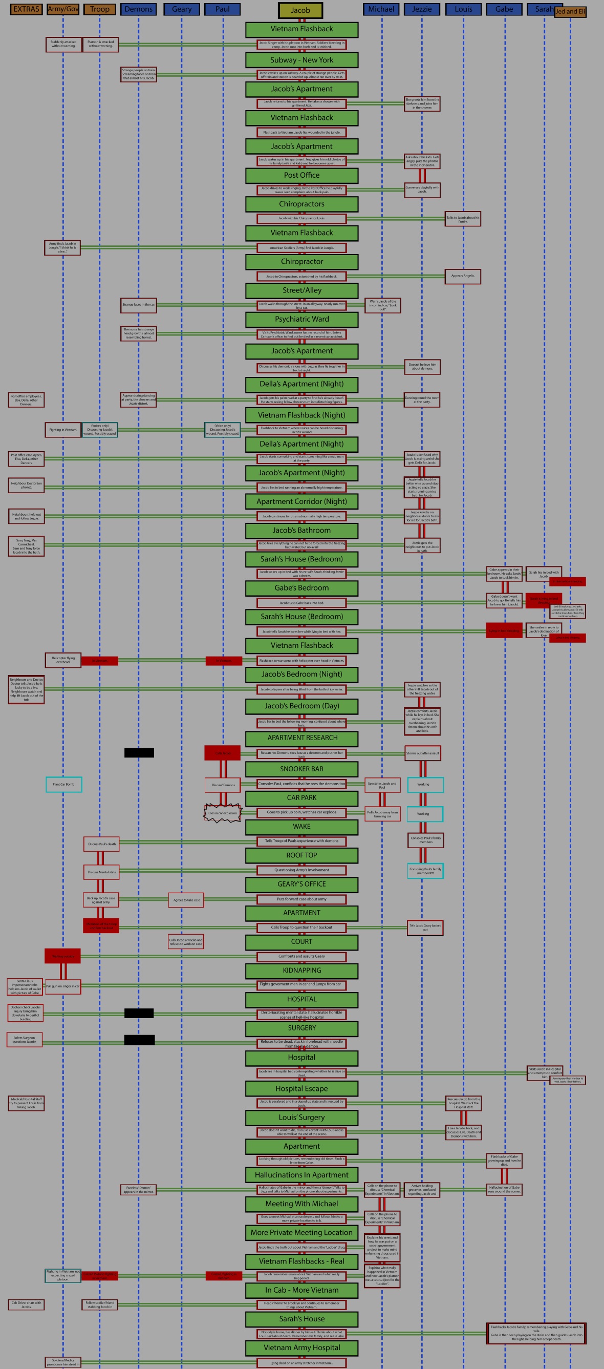
Matthew and I created the rough schematic in class collectively after watching the film. (Rose and Holly were researching artifact ideas). We used the script and the film to help us with this process. We used a whiteboard and two sides of A2 paper to cover our full schematic and its scenes. As you can see on the whiteboard and further designs below it has been influenced heavily by Phil Campbell’s work above.
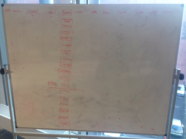
First part (less than half) of the schematic on the whiteboard
Afterwards, we each took a quarter each and went more in depth on what each character was doing within the scenes/events. A rough key was developed in class on paper, I then re-made it roughly on Photoshop and designed my section digitally using it.
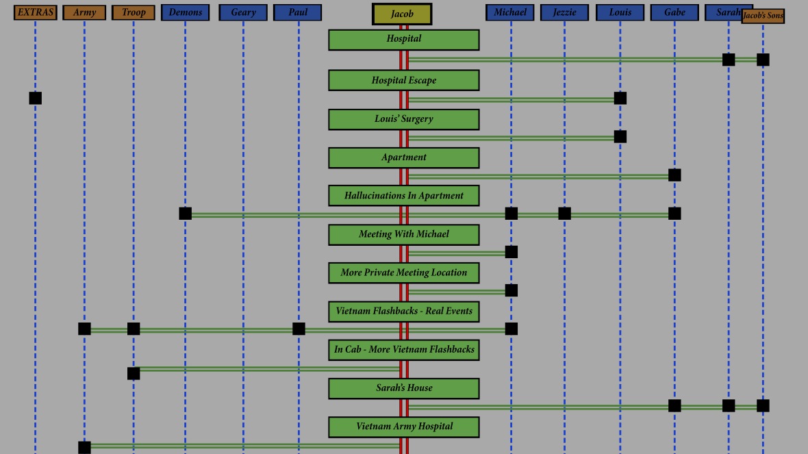
Rough Layout of the final scenes
I split the characters into Primary, Secondary and Tertiary characters.
Primary – Yellow, Secondary – Blue, Tertiary – Orange.
We had discussed this in class and came to the conclusion that Jacob was our only Primary character. A few Secondary characters were shown frequently, and it could be debated that they too are Primary characters within the story/narrative. However, the film was only based on Jacob’s life. Therefore, our thought process dictated that nobody else was shown often enough to merit becoming a Primary character.
I rewatched the last section of the film and wrote down what each character was doing in each scene/event in my Notebook (within 1-3 lines for each).
I then summarised it within my digital plan for the schematic layout below.
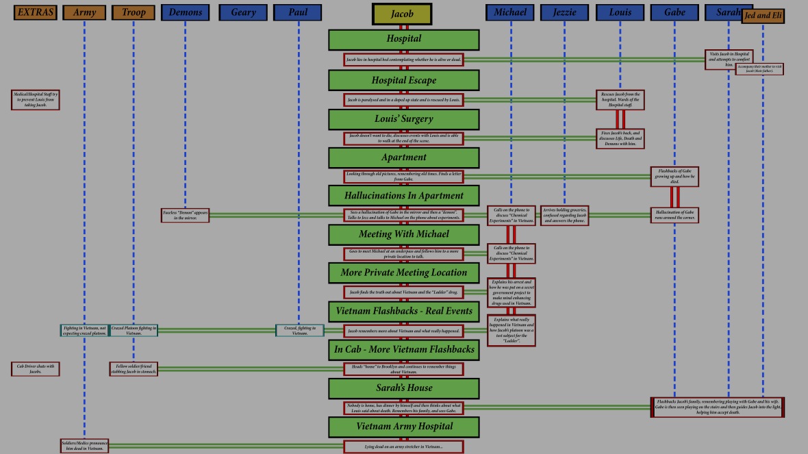
Finalised Rough Layout of the final scenes
Explanation of the Layout Above/Key
- The Events are displayed in Green and the horizontal Green Lines are used to tie the characters involved with the events together.
- The dotted Blue Lines represent an Unknown Action and the double Red Line represents an action that flows into the following Event.
- The Red Boxes represent a visible action and the Blue Boxes represent an assumed action.
Although this is only a plan, I found it somewhat enjoyable making this part of the schematic, it helped me see the bigger picture within the film as a whole.
The other members of my group drew up their version of the schematic. However, some preferred to use a more traditional approach. Therefore, in order to transfer them to a digital version, I drew up their parts up in Photoshop in my style. Matthew also wanted to draw up the schematic digitally. Therefore, I sent him my file to transfer his to the same style as the rest.
However, after giving the file to Matthew, I figured out that my layering system could do with some improvements. Therefore, I renamed the majority of the layers and organised them neatly into an easier to understand system of folders. As shown below…


Above: Each of the four sections followed a very similar sub-folder alignment… Within each sections folder, lay 5 to 6 sub-folders captioning all the key features of that section. Within those sub-folders that included text they were then split into another 2 sub-folders to help quickly locate the text and the background boxes.
Below is the final planned version of our schematic which I assembled using Photoshop, from my three files and Matthews file.
Full Schematic Plan Drawn Up On Photoshop…
As you can see it is pretty long, consisting of just under 50 events, 12 characters and roughly 250-300 Photoshop layers. Each character line has been clearly laid out, allowing us to instantly see who is doing which action, who else was involved in that action and how much of an impact the action had on the overall story.
Overall, our schematic plan might not be the most visually appealing in the world. However, it gets the point across clearly and effectively in my opinion. I am pleased with its outcome, alongside being astounded and surprised by how long it actually took…
Our team member Rose intends on modifying it with a few more stylistic designs and hand-drawn alterations. I look forward to seeing how this turns out in the next few days and I hope my file is easy enough to navigate through…
(Some time later…) Below is the final stylised schematic…
Artifact
Honestly, I haven’t thought an awful lot about the artifact until lately… I have more focused on and prioritised the completion of the Schematic. (I only briefly touched on some ideas in my sketchbook).
Thankfully, the Schematic is pretty much done by this stage. So I can now prioritise my research and time to focusing on the artifact and getting it to a point of completion too.
Artifact or Artefact?
I have seen many people spell it as Artefact… However, I feel that it is an Artifact that we are making… But, what’s the difference, right? Here’s the difference…
“Artifact: An object produced or shaped by human craft, especially a tool, weapon, or ornament of archaeological or historical interest.”
“Artefact: An artificial product or effect observed in a natural system, especially one introduced by the technology used in scientific investigation or by experimental error.”
(Words distinctions above sourced from – English.StackXChange.Com)
What is an Artifact?
Artifact – (Image sourced from NationalGeographic.Com)
Definition (sourced from OxfordDictionaries.Com) –
- An object made by a human being, typically one of cultural or historical interest.
- Something observed in a scientific investigation or experiment that is not naturally present but occurs as a result of the preparative or investigative procedure.
The reason I put both definitions in is that I think they are both relevant… Because our artifact will be made by humans (us) and should have a cultural interest (our colleagues/tutors). However, it will also be based on our observation and investigation from the film and it should be something that isn’t “naturally” present within the film.
However, back to our actual artifact/my research and concepts…
We began discussing ideas for an artifact, we had thoughts going around ranging from short films to physical objects. My favourite set of ideas revolved around the digital creation of an artifact. Allowing us to make use of Maya and its potential sculpting tools that we are currently learning (it would have also allowed me to use ZBrush which I have only recently acquired).
However, my ideas for artifacts were ranging on the impossible, at least for our current set of Maya skills. I was hoping to possibly play on the flickering effect (using lights, colours and keyframes) to represent hallucinations, deteriorating mental states and even the sense of purgatory.
Initial Maya Ideas
Faces
- A face sculpt… Using the flickering effect to change it or show a darker side to it… Using the idea of two-face (from Batman) showing a good and evil side… Representing purgatory or the comparison of his hallucinations (Gabe and “Demons”)…

Two-Face from The Dark Knight – (Image sourced from Wikiwand.Com)
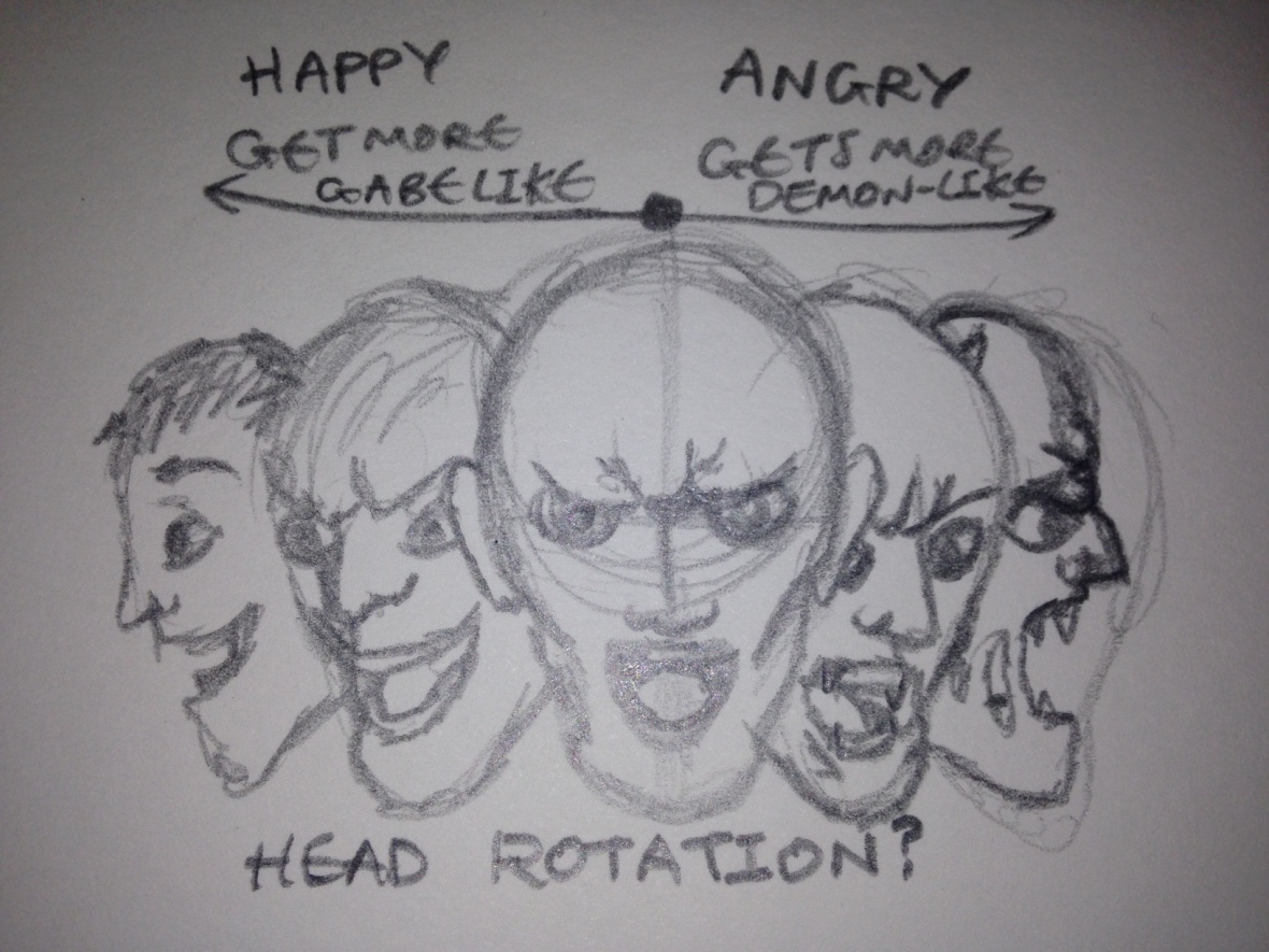
- Or, collaging faces together/stretching them and showing them from different angles. Each face possibly representing a different point of his mental state or his varying hallucinations… For example, one being a demon screaming, one Gabe smiling, the middle being Jacob. I just liked the concept it could have even been hand-drawn. The idea represents conflict, tearing of mental stability, good vs. evil and the idea of purgatory. This could be done on Maya, Photoshop or another program but my intention was for it to be a moving image (possibly a full head rotation).
Although these tattoos below, are quite disturbing, I feel that they could be quite relevant to what I am currently talking about… With showing multiple faces in different directions stretching and screaming…


Maybe something like this sort of idea…? With a variety of portraits/designs of faces including portraits of Jacob (intended for the middle) and a transitioning on either side to the faceless demon hallucinations and happy Gabe memories. Therefore, giving different perspectives of the afterlife and purgatory.
- Even creating a sculpt of Jacobs face, maybe even just a portrait of Jacob, one that would flicker back and forth from a normal face to a more evil face (one of the demon hallucinations) when a light is applied to it. The light could even rotate around the head sculpt casting an evil shadow.
Objects
- An old classic TV/Projector
Initially thinking how a creation like one of the head sculpts mentioned above could be displayed, I was thinking of an old classic tv. This could be relatively easily made with reference images. Or an old projector, the kind that played the old film reels.

(Image sourced from Quintalatrementina.Com)
- A Room
The room idea developed from the concept of the TV…
The TV could be playing Jacob’s Ladder Scenes or even just static (like below) the lights could flicker too.
The room could be filled with other items of relevance to the film, such as his book collection, a hospital bed, a map with Vietnam circled, the phone that he talked to Michael on, the photos of his family could be hung up on the wall. Dark silhouettes/shadows could even loom (representing the demonic hallucinations). Gabes laugh could be faintly overheard or he could appear and disappear.
Sounds from the film, like the car explosion, shouting, laughing could maybe be echoing in the background (representing his deteriorating mental state)… While the camera could just rotate around the room in slow motion.
Instead, the camera could cut to particular parts of the room that have relevance and tie it with the sound from the film. For example, the hospital bed could be tied with Jacobs screams during his hallucinated operation.
(Image sourced from – ThePlaylist.Net)
Although I really did like the sound of some of these ideas, they are quite impractical and farfetched. We would have struggled to get any of them finished in time (while working collaboratively) with our current limited Maya skills/capabilities. Therefore, I swiftly moved on to more practical realistic ideas.
Album
We had discussed ideas revolving around what we wanted to show within our artifact, everyone else was very keen on focusing entirely on the implicit meanings of the film. Don’t get me wrong, I wanted to also, but I thought the explicit meanings were equally key.
In order to show the deterioration of Jacob’s mental state, we decided to go with the concept of a photo album. Therefore, together as a group, we came to the decision of doing a Photo album. This idea was thrown out there earlier on by another group member, but it was one that we came back to and developed upon.
We had come up with other ideas. However, due to the deadline looming we fired on ahead with the album concept. Below is the album that the group decided on…
Our thoughts are to suggest a lot of implicit themes within the album, linking key parts of the film directly or indirectly to the viewer through the album. Almost like the film does itself, having a lot of underlying implicit themes residing under the surface.
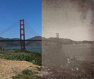
Therefore, I started collecting photos of the characters and applying an older style effect to them. Here are my photos of Gabe which I took mainly from the film and then manipulated with overlying layers on Photoshop to make them look old and aged.
Luckily, I knew how to do this relatively quickly and easily due to having some experience with the process before… The image below demonstrates roughly how it works.
(Image sourced from – PopSugar.Com)
We discussed the idea of the photo album being to his wife, Sarah. This would allow us to include some context behind the family photos inside and make them relatable. Tying it both to Jacob’s family as well as his more fond memories.
The idea then developed to include photo manipulations. We decided to split the album into two sections. The first section would include his happy fond memories and would end with a blank space (subtly representing his death). The second section would then include the photo manipulations that would slowly and progressively get worse, displaying the idea of mental deterioration, delusions and purgatory. The edges could also be burned representing the torture and pain of purgatory and his hallucinations.
This section would be more stylised and would allow us to possibly add in some kind of artwork into the photo manipulations. It would either conclude with completely distorted photos or missing sheets that have been torn out or burned off.
The concept of burning/weathering/ageing the album was also discussed and we thought this was a great idea. This was a link to Jezzie throwing the old family photos into the incinerator.
(Image sourced from – Quizizz.Com)
All of this later sparked an idea for me while I was rewatching the film, blogging and looking for character images to manipulate.
The Potential Breakthrough Idea
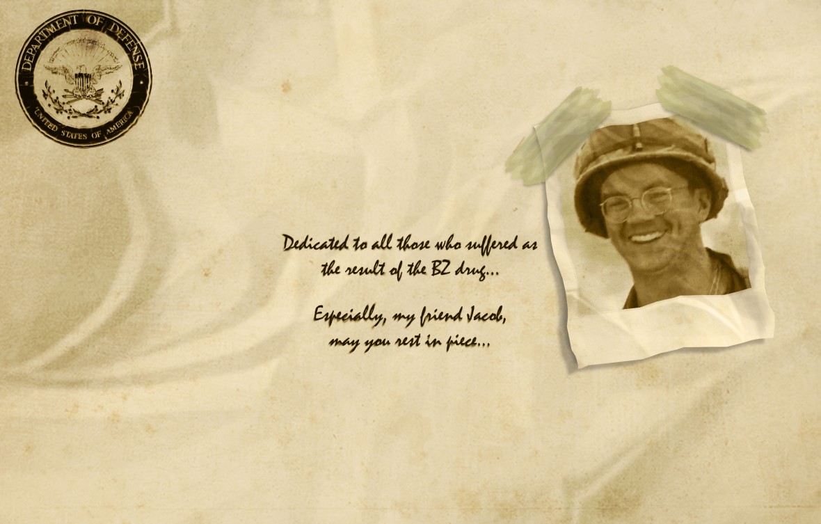
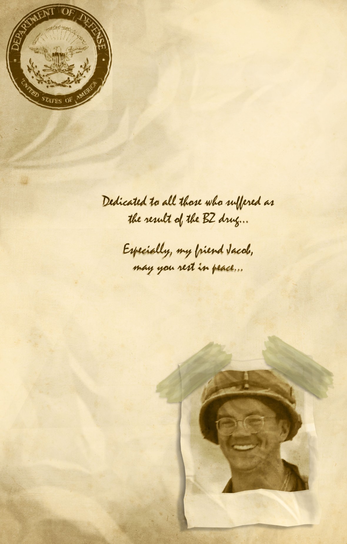
We could make the album look like a case file… It could then represent the deteriorating and lasting impact of the BZ drug (3-Quinuclidinyl Benzilate) on its patients. As shown at the end of the film, where it says that the Pentagon denied the story.
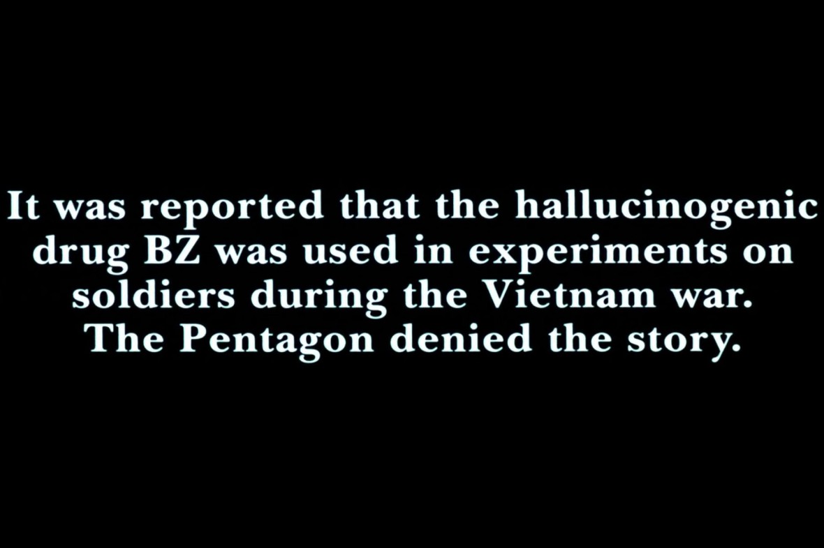
Pentagon Denial/BZ Drug Reference – (Image sourced from Jacob’s Ladder (1990))
This would allow us to fully make use of the layout of the album, as we were struggling to come up with concepts of how to fill each sheet of the album. Something similar to the photo references below, from what appears to be a comic series named DeepDiveDaredevils.


I was mainly referring to the short excerpt sized sheet on the bottom right of the second photo… As this would be almost the perfect size for to fit in the bottom section of an album page (rough size – 15cm long/10cm high sections)…
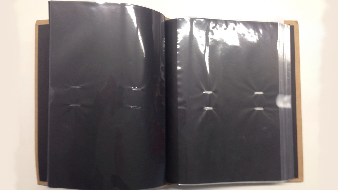
Photo Album Sheet Size
I researched other examples of secret documents and templates for them… Specifically in the style of an FBI or Pentagon document as displayed in films and such. Below is the sort of style I was looking for…

(Image sourced from FlyingTigerComics.Wordpress.Com)
We could display important key quotes in these sections, or themes or even just ideas and concepts… Any of the above would work and hopefully add to the meaning and depth within the artifact…
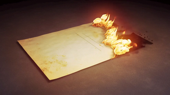
For a further link, it would give more of a reasoning to the burned sections, as someone (from the Pentagon) could have tried to destroy this piece of evidence to cover it up.

Burning Doucments Image – (Sourced from Blog.Bliubliu.Com)
I developed upon my idea a little more before sharing it with the group. I wanted to ensure that I had an established foundation and I knew what I talking about before suggesting it…
I tried to think of how the album would be incorporated into it, we were working with ideas that Jacob had made it for his wife (Sarah). However, in my head that concept didn’t quite work… Mainly because of the contents of the album. Why would Jacob make something filled with distorted photographs and drawings, that represent his mental deterioration for his wife?
A puzzled looking Jacob face – (Sourced from Jacob’s Ladder (1990))
Therefore, I changed that idea and adapted it to my new case file concept. The album could be made by Michael, the regretful creator of “the ladder” drug. It made a lot more sense now, in my opinion anyways. Michael mentioned that the reasoning behind him tracking Jacob was that he was one of the survivors. Making it a perfectly viable subplot within the film for Michaels character to be documenting evidence (influenced by the idea of a schematic… “What is the character doing while not on screen?”).
Michael would be using the album to create a case against the government. Or even for the purposes of trying to make the dangers of the ladder known about (he could show it to Jacob to help him understand).
However, why would Michael be using an album, not a journal? Questions like these came to my mind too… I then came to the revolutionary idea that Michael was calling Jacob to get his assistance with the file. Therefore, giving reasoning for the album, as it could be how Jacob shows Michael his side of the story and how it has impacted his life…
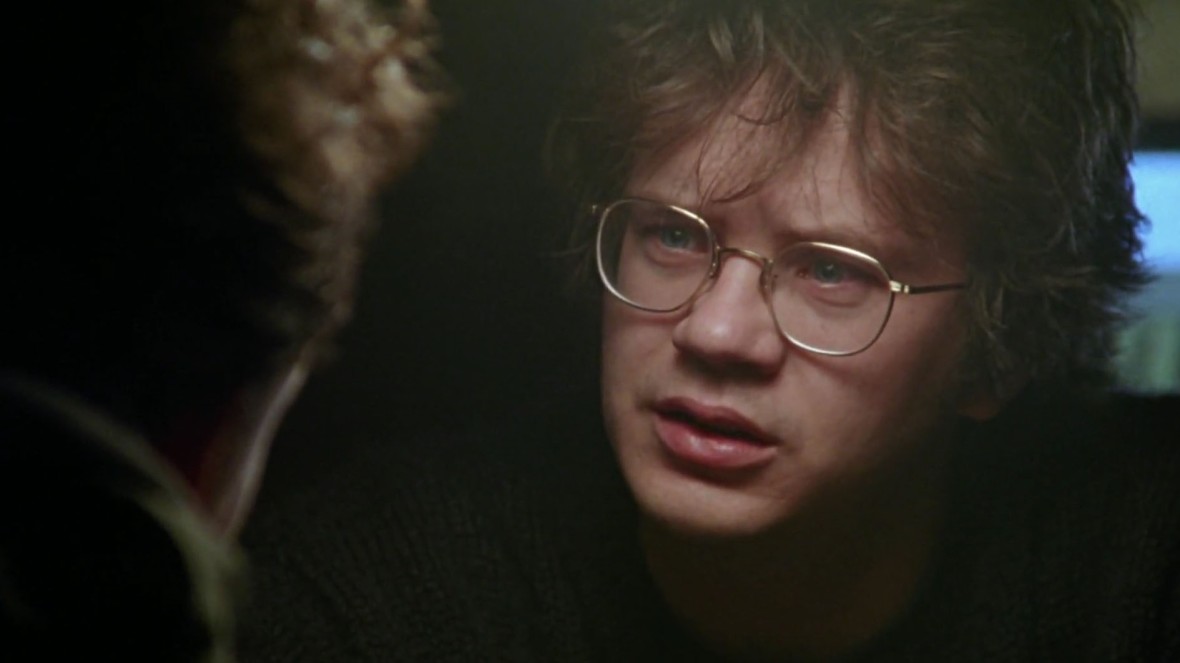
Jacob talking with Paul about Demons – (Image sourced from Jacob’s Ladder (1990))
It would probably have stories of Jacob’s fellow platoon members in there too… For example, Paul, when he came to talk to Jacob about Demons and his fate just before he died (in the image above)… Now that I think of it Michael was there too… He could have been trying to get Paul’s testimony while he was there. Since Paul was a fellow survivor of “the ladder” drug too.
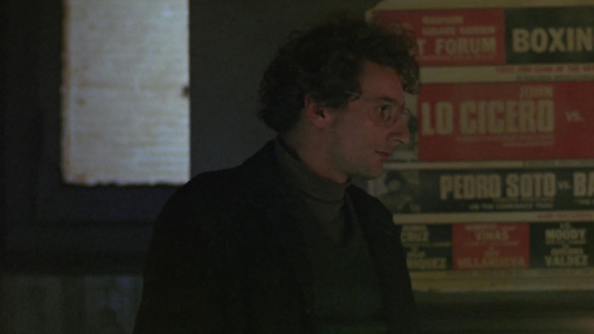
Michael in the bar while Jacob is talking to Paul – (Image sourced from Jacob’s Ladder (1990))
It would be filled with images from Jacob’s past. Alongside, manipulations of photographs, sections of writing and drawings of the hallucinations. It could then include Michaels notes, opinions and documents in it too…
All of this information would help in attempting to build a strong case against the government (which Jacob tried to file within the film, but was declined by Geary, the lawyer).
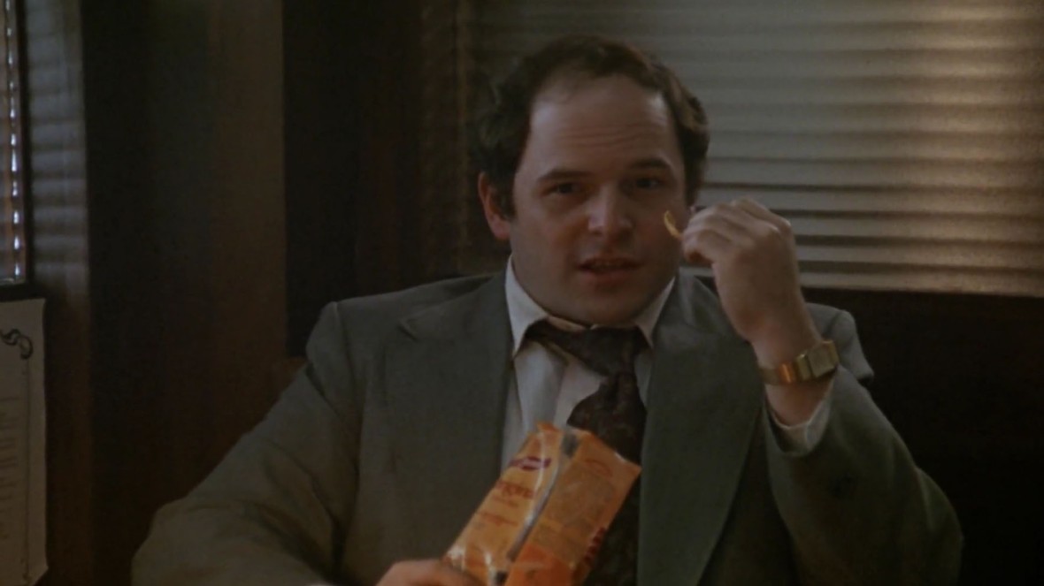
The Lawyer, Geary, Jacob attempted to hire in the film – (Image sourced from Jacob’s Ladder (1990))
I informed the group of this rough concept for the album and they all seemed to be for it…
Therefore, I started designing old crumpled page styles, logos and even a rough script for what each section could contain…
Here is an example below, on the left you can see the sourced an image (source can be found on the image). I then took it, resized it, and edited it to make it look both aged and look more like a stamp. It was simple enough but I think it is effective.
(Mainly done through duplicating layers, low opacity eraser tool and shadowing it.)
I made a few more assets that could help display it as an old case file…
The evidence stamp is just an example of a stamp that could be put on the album. It was made with the text tool and paint bucket tool, then it followed the same process as the “Department Of Defense” logo stamp that I made. The old crumpled paper design was made using the gradient tool (from different directions about 10-15 times) creating the weird crumpled pattern, then adjusting the colour, contrast and brightness I made it more believable. Finally, I placed a few “overlay” layers over the top to give it more texture and colour.
Below is an example of a dedication page for the album to Jacob (in the idea of the artifact, Jacob was helping Michael).
The image used was from the film and then manipulated. I made a couple of versions of this dedication page, some had more faded text and such. However, I think it looks reasonably well and I enjoyed trying to make a 3D looking photo that was stuck on. I was toying with the idea of tape, staples and paper clips to attach photographs. I may include these in designs later in this post…
I adjusted the style to a full size page (for the size of our album anyways)… In this one below I changed the size/scale of particular sections of the page, I also applied more of a faded look to it and more of a bleed effect on the writing/text…
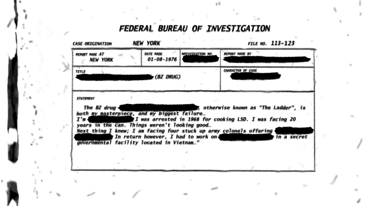
I quickly drafted up an FBI document in the style I showed earlier by FlyingTigerComics. I used their document as inspiration and as a rough template. I made a smaller version of it and re-created/re-drew every part of it in my own style (even the smudges).
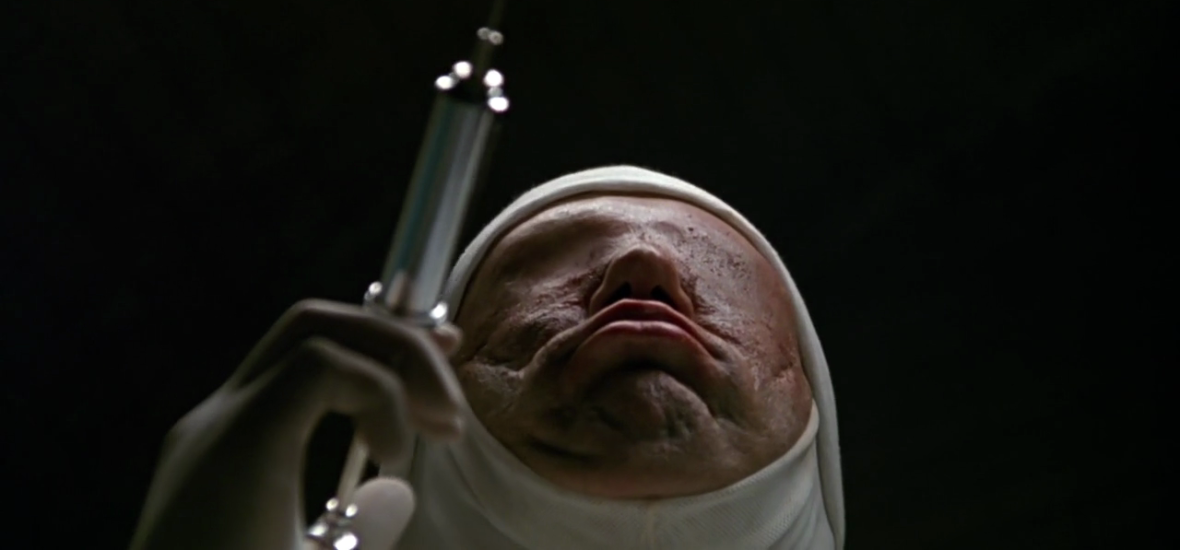
I drew an image of one of the demons from the film… I wanted it to look like Jacob had drawn it, so I drew it in a sketchy style as if he was drawing it from his hallucination/nightmares… I based it on the image below (from Jacob’s Ladder (1990)), but I moved the needle to the left more to stress the fact that he has no eyes…
I tried to incorporate it along with some text in a PSD (Photoshop) file, making it look like a sketch done by Jacob. I tried to imply that Michael had written it without explicitly saying so… I attempted to make it look like it was attached to the page, so I used some low opacity layers beneath it and drop shadowing to create the slight 3D effect. The staples were just to try something else other than tape.
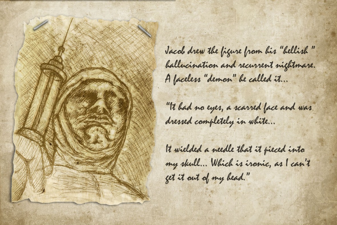
I enjoyed designing this and coming up with the “vague” writing alongside it, I attempted to suggest that Michael was writing it and Jacob was drawing the image. Therefore, I began working on a bit of a narrative for the album/file and was starting a few designs…
However, after further discussion with my team, I discovered that they wanted it to be more subjective and implicit. Basically, in simple terms, keeping the artifact vague… They sort of want to imply things, without directly showing them. This would then create a more implicit and thought-provoking artifact. However, this too could be difficult enough to achieve…
Once I figured out their vision for the artifact some more I began back into photo manipulations again…
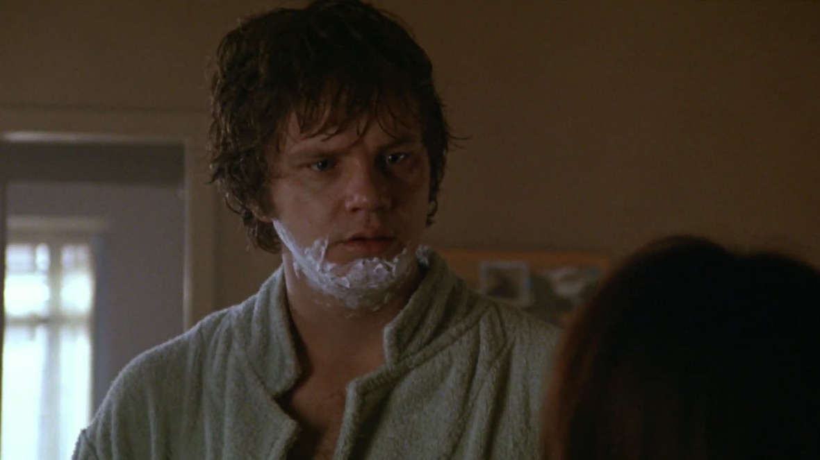
Holly was working with a photograph of the actor (Tim Robbins) who played Jacob Singer in the film… Here it is below…
Image sourced from – Iv1.Lisimg.Com
She asked me to do a few photo manipulations with it that represented the demons from the film…
Therefore, I found all the scenes where the demons were shown and I screenshotted them and applied the old style photo look to them…
I then started manipulating it to look like the demonic hallucinations in the film. I also manipulated screenshots of Jacob from the film to make it look like them too…


To help you understand this manipulation (above), please watch the first 20 seconds or so of the video below…
Here are some of the screenshot manipulations that I made (below)…
These set of images below were my main set of Jacob photo manipulations… I feel that they have that creepy eerie feel that Holly was looking for. To me, they have a clear representation of the demons from the film… I am pleased with them and enjoyed making them. It was difficult at first to craft his head without hair and make it look realistic, it was much easier to remove his eyes and mouth. However, once I had done this, the stitches and scars, even the mouth was easy enough to create with decent realism.
(Some time later…) Here is our final artefact album…
These are only a few of the photographs I took in class to roughly represent the 3 point structure that it follows… The beginning section is of family photos (like my old images of Gabe), representing life, memories and happier times. Then we move into the following section where Jacob dies. This is left blank and is covered in blood… We then move on to the purgatory that he lives in, represented by the demonic hallucinations and the repetitive (and progressively getting worse) photo manipulations of Jacob. Eventually leading to his point of acceptance with death where the images have a lens flare effect added to them to represent him walking into the light and accepting death. Our album was purposely left open-ended (reflecting the open-ended-ness of the film itself). The album/artifact didn’t turn out exactly as I had envisioned it… But I am very pleased with its end result…
The Legacy of Jacob’s Ladder
This video below goes into a decent amount of detail on the story, plot, themes and aspects of the film… It covers the majority of the evil hallucinations that Jacob sees… The video also mentions films and games that were inspired by Jacob’s Ladder (1990)… One such example being the Silent Hill series of games (which has went on to inspire an entire genres worth of games).
The film itself has way to big a legacy to go into within a short conclusion… Even the video doesn’t fully cover it. However, the themes and story are still relevant to this day and applicable to almost everyone. The film although it may be disturbing, is definitely worth a watch.
In conclusion, even though I was slightly puzzled as to why we got this film in the first place. Looking back at it, I now have a better understanding and appreciation for it, and for why we were assigned it. It was a very interesting film to study and watch, I think I could even say I am glad we got this film. I am hoping that this will potentially aid/influence some of my future pieces to help develop them (even if it is just through furthering their implicit meaning).
